SaaS businesses rely on accurate data to understand user behavior, track performance, and guide product decisions. An analytics dashboard brings all these insights into one place, helping teams move faster and stay aligned on goals.
This blog covers 15 practical analytics dashboard examples tailored for SaaS teams. Each one highlights specific metrics that matter, from user acquisition to revenue trends, so you can focus on what drives growth.
Looking for a straightforward way to access these insights? Usermaven offers ready-made dashboards built for modern SaaS teams, with no complex setup required.
What is an analytics dashboard?
An analytics dashboard is a visual interface that organizes and presents key data points in a centralized, easy-to-read format. For SaaS teams, it helps monitor performance, track user behavior, and evaluate business health, without switching between multiple tools or reports.
Purpose of an analytics dashboard
The main goal of an analytics dashboard is to provide real-time, actionable insights. It allows product, marketing, and growth teams to make informed decisions based on live metrics rather than assumptions or delayed reports.
How it works
Analytics dashboards pull data from various sources, such as your website, product, CRM, or marketing attribution tools, and present it using charts, graphs, and summaries. Depending on the setup, they can be customized to focus on metrics like signups, feature usage, churn rates, or revenue.
Why it matters for SaaS
For SaaS businesses, time and clarity are critical. A well-designed analytics dashboard reduces the noise and highlights the metrics that matter most. It improves visibility, encourages collaboration, and helps teams spot trends or issues early.
In short, an analytics dashboard simplifies complex data and brings focus to what matters most, making it an essential tool for every SaaS team aiming to grow with clarity and speed.
Key features of an effective SaaS analytics dashboard
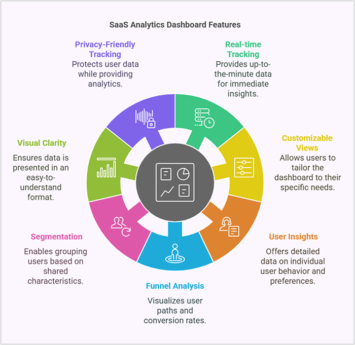
A good analytics dashboard doesn’t just display data, it helps you understand and act on it. For SaaS teams, the right features make all the difference in day-to-day decision-making and long-term growth planning.
Real-time tracking
Timely decisions depend on timely data. Real-time tracking ensures that you’re always looking at the most up-to-date metrics, whether it’s active users, trial signups, or key events in the product.
Customizable views
Different teams need different data. A customizable dashboard lets product, marketing, and growth teams focus on the metrics that matter to them, without the clutter of irrelevant information.
User and account-level insights
Understanding behavior at both the individual user and company level is critical in SaaS. Dashboards that support user and account-level insights help teams improve onboarding, spot upsell opportunities, and reduce churn.
Funnel and journey analysis
Tracking how users move through sign-up flows, product onboarding, and feature adoption helps identify drop-off points. A good dashboard should clearly show conversion funnels and user journeys.
Segmentation and filtering
Not all users behave the same. Segmenting by plan, location, signup source, or lifecycle stage helps teams uncover patterns and tailor their strategies accordingly.
Visual clarity and simplicity
Even with complex data, the dashboard should stay easy to read. Clean design, logical layouts, and the right mix of charts and graphs make the experience efficient, not overwhelming.
Privacy-friendly tracking
With growing concerns around user privacy, a modern SaaS dashboard should support compliant and cookieless tracking methods without compromising on data accuracy.
Power up your SaaS
with perfect product analytics
*No credit card required
Incorporating these key features into your SaaS analytics dashboard ensures you’re not just gathering data, but using it effectively to drive growth and improve decision-making at every level.
15 analytics dashboard examples for SaaS insights
An effective SaaS analytics dashboard provides real-time insights to help teams track performance, optimize processes, and drive growth. Below are 15 essential dashboards that provide valuable insights across various aspects of your SaaS business.
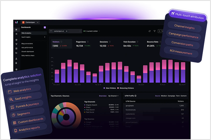
1. Web analytics dashboard
The web analytics dashboard provides an overview of your website’s performance, including visitor behavior, traffic sources, and engagement trends. It helps you understand where your users are coming from, how they interact with your site, and which content or pages are driving the most value. With this data, you can optimize user experience, improve site navigation, and increase conversions.
2. User acquisition dashboard
This dashboard focuses on tracking how new users are acquired. Metrics typically include signups, traffic sources (e.g., paid ads, organic search, referrals), and customer acquisition cost (CAC). By understanding which channels are performing best, you can optimize your marketing spend and allocate resources more effectively. This dashboard ensures you focus on the most successful acquisition strategies.
3. Activation & onboarding dashboard
The user activation dashboard tracks the user journey from signup to active usage, highlighting key onboarding events like profile completion or first feature use. By tracking these metrics, you can identify any friction points in the onboarding process that may be causing users to drop off. The goal is to ensure users understand the product’s value quickly, helping to drive early engagement and long-term retention.
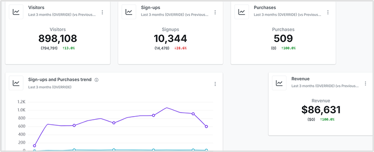
4. SaaS insights dashboard
The SaaS insights dashboard offers a tailored view of metrics that matter most to SaaS businesses, such as active users, feature usage, signups, and churn rates. This dashboard helps you monitor growth, user behavior, and subscription performance in one place. With actionable insights at your fingertips, you can make strategic product and marketing decisions with greater confidence.
5. Feature adoption dashboard
This dashboard tracks how frequently users are engaging with specific features of your product. It helps you understand which features are most valuable to users and which might need improvement or better promotion. By analyzing feature adoption rates, you can prioritize product updates and ensure that your users are getting the most out of your software.
6. Customer retention dashboard
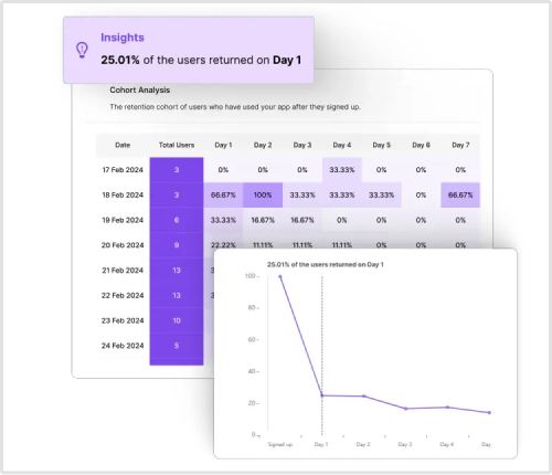
A customer retention dashboard focuses on tracking user engagement over time and identifying potential churn risks. Metrics like cohort analysis (grouping users by signup date), retention rates, and customer lifetime value (CLV) can be monitored. By spotting trends in retention, you can implement targeted strategies to improve customer loyalty and reduce churn, such as personalized engagement or proactive support.
7. Churn analysis dashboard
Churn analysis dashboards give insights into why customers leave your service. By tracking cancellation rates, reasons for leaving, and trends in user behavior before churn, you can identify recurring patterns. This information helps you address pain points, refine your offerings, and reduce churn through initiatives such as retention campaigns or product improvements.
8. Revenue & MRR (Monthly Recurring Revenue) dashboard
This dashboard tracks important financial metrics such as MRR, revenue growth, and ARPU (Average Revenue Per User). It helps you monitor your company’s financial health by highlighting trends in revenue, customer upgrades or downgrades, and new revenue streams. With MRR tracking, you can forecast future growth, plan budgets, and make informed decisions about pricing strategies and product development.
9. Product usage dashboard
The product usage dashboard focuses on user interactions with your product, showing which features, pages, or actions are most engaged with. This data helps you identify user behavior patterns and understand what’s driving user engagement. With this information, you can prioritize feature development, optimize the user interface, and improve the overall user experience.
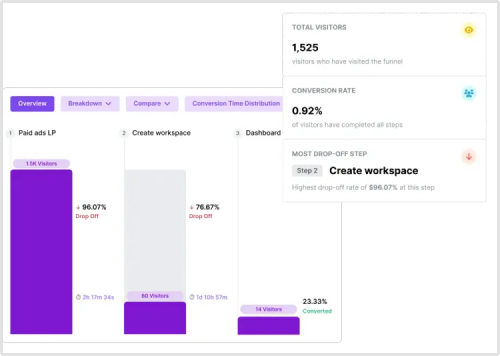
10. Funnel conversion dashboard
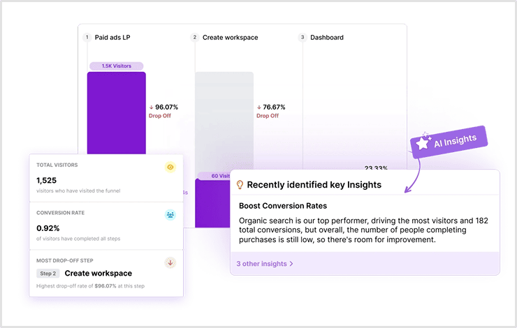
This dashboard tracks user conversion at each stage of the sales or signup funnel. From initial website visit to subscription or purchase, the conversion funnel dashboard visualizes how users move through your funnel and where they drop off. Identifying conversion bottlenecks lets you refine your user flows and marketing strategies to improve conversion rates at each stage.
11. Customer journey dashboard
A customer journey dashboard gives you a comprehensive view of how users engage with your brand from first touch to long-term relationship. This includes tracking key milestones like first product usage, feature engagement, and customer support interactions. By understanding the full customer journey, you can identify opportunities to improve the user experience, reduce friction, and increase satisfaction throughout the lifecycle.
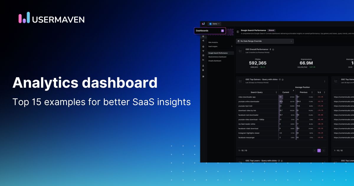
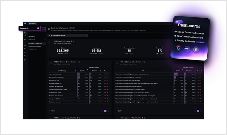
12. Google search performance dashboard
This dashboard gives you a deep dive into how your site performs in organic search. Track clicks, impressions, average position, and CTR across queries and landing pages. It helps identify high-performing keywords and content opportunities while also highlighting pages that need optimization. With this visibility, you can refine your SEO strategy and boost search visibility.
13. Marketing performance dashboard
This dashboard tracks the performance of your marketing efforts, focusing on metrics like website traffic, lead generation, customer acquisition cost (CAC), conversion rates, and return on investment (ROI). By monitoring these key metrics, you can measure the effectiveness of your campaigns, optimize ad spend, and make data-driven decisions about future marketing strategies.
Maximize your ROI
with accurate attribution
*No credit card required
14. WooCommerce analytics dashboard
The WooCommerce dashboard centralizes your e-commerce performance metrics, including revenue, orders, product sales, and customer behavior. With insights into marketing channels, repeat customers and top-selling items, it streamlines decision-making for store owners. Whether you’re optimizing for conversions or improving customer retention, this dashboard makes your store’s data easy to act on.
Related: What is enterprise analytics?
15. Custom KPI dashboard
A custom KPI dashboard allows you to track your unique key performance indicators (KPIs) that are most relevant to your business goals. For example, if you’re focused on product usage, customer lifetime value (CLV), or feature adoption, you can design a dashboard tailored to those metrics. A custom dashboard ensures you’re focused on what matters most to your team, providing flexibility and focus in your decision-making.
By leveraging these 15 analytics dashboard examples, SaaS businesses can make data-driven decisions that lead to smarter strategies, improved user engagement, and sustainable growth.
How to choose the right analytics dashboard for your SaaS
When selecting the right analytics dashboard for your SaaS, it’s essential to choose a tool that offers both pre-built dashboards for quick insights and the flexibility to create custom dashboards tailored to your specific needs. Pre-built dashboards provide immediate access to core metrics, while custom dashboards let you track the most relevant KPIs, allowing you to adapt as your business evolves.
A tool that offers this dual capability ensures you have both immediate value and long-term flexibility to optimize your analytics strategy. Usermaven provides the perfect balance with built-in dashboards for essential insights and robust customization options to track your unique metrics. Whether you’re looking to analyze user behavior, feature adoption, or revenue growth, Usermaven enables you to design the ideal dashboard for your SaaS business.
Usermaven: A simple, powerful analytics dashboard for SaaS teams
Usermaven provides a simple yet powerful analytics dashboard, perfect for SaaS teams looking to make data-driven decisions without the complexity often associated with traditional analytics tools. With its intuitive design and robust features, it offers everything your team needs to track performance, optimize strategies, and accelerate growth.
Customizable dashboards for your specific needs
Usermaven gives you full control over your data, allowing you to create dashboards tailored to your exact business needs. Whether you’re tracking user behavior, marketing performance, or product metrics, you can design a dashboard that reflects the key insights your team requires to succeed.
Pre-built dashboards for quick insights
In addition to custom dashboards, Usermaven offers a selection of pre-built dashboards, including those for website analytics, product analytics, woocommerce, and Google search performance. These dashboards are designed for immediate use, helping you quickly gain insights into areas like sales, conversion rates, and SEO performance. They come ready to use, so you don’t have to spend hours setting up your reports.
Real-time data updates
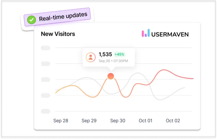
Usermaven ensures that you always have the most current data by offering real-time updates for all your metrics. As your business evolves, your data does too, enabling you to make timely decisions based on the latest trends and performance indicators.
User-friendly and intuitive interface
With its clean and intuitive interface, Usermaven ensures that even non-technical users can easily navigate and analyze their data. This makes it a great tool for marketers, product managers, and other team members who need to stay informed without getting bogged down by complex technicalities.
Seamless team collaboration
Usermaven allows teams to share dashboards and insights effortlessly, ensuring alignment across departments. You can set role-specific permissions to ensure that team members only see the data they need, and you can collaborate in real-time to stay on top of performance metrics.
Advanced customization options
Usermaven also provides powerful customization features, so you can fine-tune your dashboards. With drag-and-drop functionality, flexible chart sizes, and the ability to group related metrics, you can design a dashboard that suits your workflow and priorities perfectly.
Easy integration with data sources
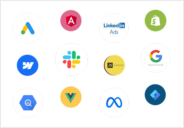
Usermaven seamlessly integrates with a variety of data sources, meaning you can pull data from different platforms like your CRM, marketing tools, or e-commerce platforms. This allows you to centralize all your key metrics in one place, providing a unified view of your performance.
With Usermaven, you can streamline your analytics, create insightful reports, and make smarter, data-driven decisions. Whether you need quick insights through pre-built dashboards or full customization, Usermaven has everything SaaS teams need to succeed.
Conclusion about analytics dashboard
Choosing the right analytics dashboard is crucial for SaaS teams looking to optimize performance, track key metrics, and make informed decisions. With the 15 analytics dashboard examples we’ve explored, it’s clear that having a flexible, intuitive platform is essential to explore deeper insights into your business.
Usermaven stands out as an excellent choice, offering customizable dashboards, real-time data updates, and pre-built templates tailored for specific needs like WooCommerce and Google Search Performance. Whether you’re a marketer, product manager, or part of a larger SaaS team, Usermaven’s powerful, user-friendly dashboard helps you make data-driven decisions faster and more efficiently.
By leveraging the right analytics dashboard, your team can not only streamline operations but also drive smarter strategies that lead to growth. Start simplifying your analytics with Usermaven today and take your SaaS insights to the next level.
Website analytics tool for modern marketers & agencies
*No credit card required
FAQs about analytics dashboard
1. How can an analytics dashboard improve team collaboration?
An analytics dashboard helps teams stay aligned by providing shared access to real-time data and insights, ensuring everyone is on the same page and making data-driven decisions together.
2. Can an analytics dashboard integrate with third-party tools?
Yes, most modern analytics dashboards, including Usermaven, offer seamless integration with a variety of third-party tools and platforms like CRMs, e-commerce systems, and marketing software.
3. What is the difference between a reporting dashboard and an analytics dashboard?
A reporting dashboard mainly focuses on presenting data in a structured way, while an analytics dashboard not only displays data but also helps analyze trends, patterns, and deeper insights for informed decision-making.
4. Are analytics dashboards scalable for growing businesses?
Absolutely! Most analytics dashboards, including Usermaven, are designed to scale with your business, handling increasing amounts of data and providing deeper insights as your needs grow.
5. How does an analytics dashboard handle data security and privacy?
Top analytics dashboards, such as Usermaven, prioritize data security and privacy, offering encryption, secure data storage, and compliance with privacy regulations like GDPR to ensure your data remains safe.
6. Can an analytics dashboard be customized for specific user roles?
Yes, many analytics dashboards, including Usermaven, allow you to create role-specific dashboards with customized data access and permissions, ensuring relevant insights are shared with the right team members.
7. What makes an analytics dashboard user-friendly for non-technical users?
A user-friendly analytics dashboard simplifies data presentation with clear visuals, intuitive navigation, and drag-and-drop customization, making it easy for non-technical users to access and understand key metrics.
8. Can I track customer behavior and engagement in real-time with an analytics dashboard?
Yes, real-time tracking is a key feature of many analytics dashboards, allowing you to monitor customer behavior and engagement as it happens, enabling faster responses and more agile decision-making.
9. How do analytics dashboards help with A/B testing and conversion optimization?
Analytics dashboards allow you to track and compare A/B test results, providing insights into which variations perform better, helping you optimize conversion rates and make data-driven improvements to your strategies.
10. Can I set alerts for specific metrics in my analytics dashboard?
Yes, many dashboards, including Usermaven, allow you to set custom alerts for key metrics, so you’re notified when certain thresholds are met, ensuring you never miss important changes in your data.